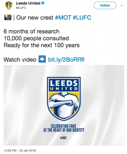
2019 mark’s Leeds United’s centenary year as a football club.
In those 100 years, they have won three first division championships, one FA Cup, a League Cup, and in their more recent future reached the semi final of the Champions League, so what better what to commemorate the occasion than a fan led consultation for a rebrand of the clubs famous badge?
Wednesday the 25th January, the big unveiling. The clubs Managing Director, Angus Kinnear, releases the following statement to Sky Sports:
“We got a wealth of input from over 10,000 supporters. One of the things that was a fairly consistent message was there wasn’t a great deal of affection for the current crest. They saw it as symbolising instability off the pitch and not great performance on it,”


With all that guidance and support from loyal stakeholders, you would have thought the feedback received would be overwhelmingly positive right? Well think again. Some responses from fans included:
“The badge is absolutely awful, should go back to the white rose badge that fans loved if you fancied a change, fans wont buy club merchandise im sure with that on it, embarrassing”
“As a Leeds fan, I’ve been through a lot. I stuck by them after they sold star platers. Through relegation to the Championship, through bankruptcy, relegation to League One. Through the nightmare of Massimo Cellino, but the new crest could be the final straw!!!”
Even star player, Pontus Jansson, took to his personal Twitter, stating he was ‘shocked’ at the new logo.


There is an overwhelming feeling between the supporters culminating from various media outlets that no fans were consulted during the research of the badge, resulting in outrage. So much so that just over 24 hours later, a petition has attracted over 70,000 signatures for the chairman to stop the club implementing the ‘Leeds Salute’ crest stating it makes a mockery of the clubs history and is alienating the fans. Ouch.
It appears as if the clubs marketing and design department have taken their research, torched it and curated a design they feel will please the masses. Not the greatest of approaches when your clientele are one of the most hardened and notorious fan bases in the country.
The perfect case of ‘Graphic Design gone wrong’.
Back to the drawing board LUFC… Maybe take some pointers this time eh?


Recent Comments